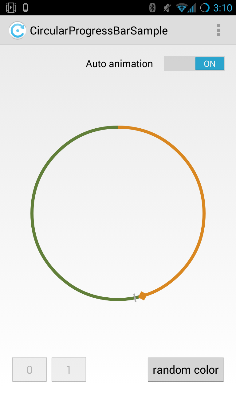
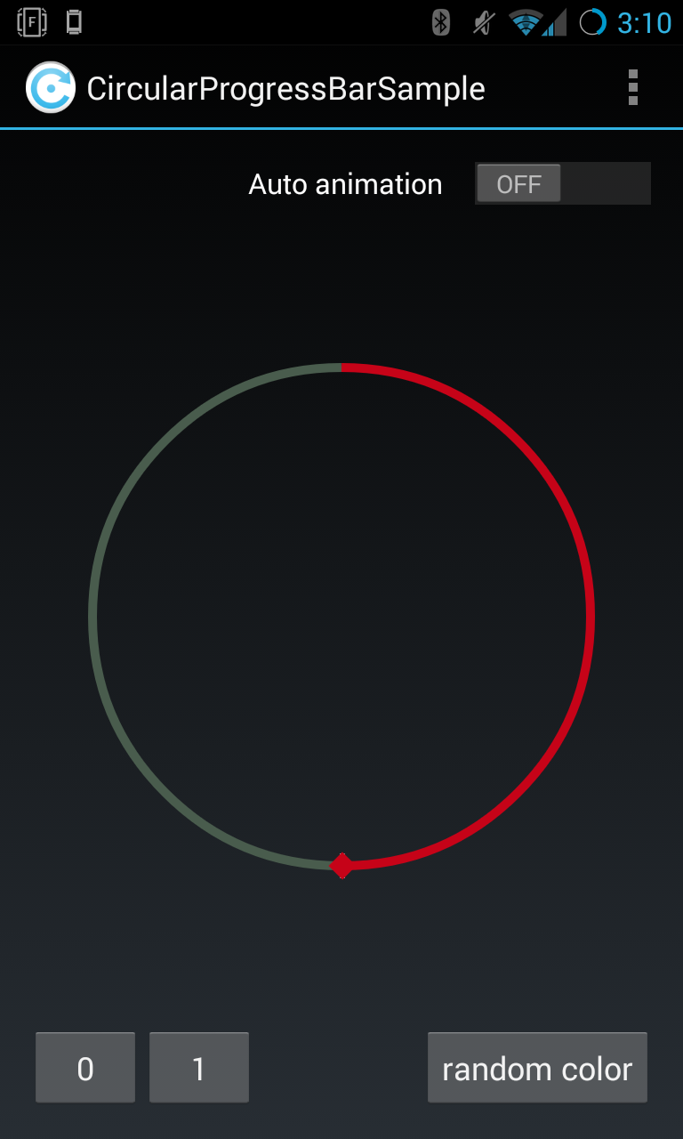
HoloCircularProgressBar is a Custom View implementation for Android you might know from the Android Clock App from Android 4.1
You can see the ProgressBar working in the sample application. Just check out the library and create a new "Android Project form Existing Code"
Add the View in your Layout
<de.passsy.holocircularprogressbar.HoloCircularProgressBar
    android:id="@+id/holoCircularProgressBar1"
    android:layout_width="wrap_content"
    android:layout_height="wrap_content"/>
The following classes could not be instantiated:
- de.passsy.holocircularprogressbar.HoloCircularProgressBar (Open Class, Show Error Log)
See the Error Log (Window > Show View) for more details.
Tip: Use View.isInEditMode() in your custom views to skip code when shown in Eclipse
If your Layout Editor can't draw the view, you have to restart Eclipse. There is a bug in the ADT Plugin
Missing styles. Is the correct theme chosen for this layout?
Use the Theme combo box above the layout to choose a different layout, or fix the theme style references.

Failed to find style 'circularProgressBarStyle' in current theme
You have to add a style for this View. see below
There are several XML attributes you can add the the HoloCircularProgressBar
<de.passsy.holocircularprogressbar.HoloCircularProgressBar
    android:id="@+id/holoCircularProgressBar1"
    android:layout_height="wrap_content"
    android:layout_width="wrap_content"

    app:stroke_width="10dp"
    app:progress="0.4"
    app:marker_progress="0.6"
    app:progress_color="@android:color/holo_orange_dark"
    app:progress_background_color="#cccccc"
    app:gravity="center"
    app:marker_visible="false"
    app:thumb_visible="false"/>
Don't forget to add a default style to your AppTheme
<style name="AppTheme" parent="android:Theme.Holo">
    <item name="circularProgressBarStyle">@style/CircularProgressBar</item>
</style>
I added two simple styles @style/CircularProgressBar and @style/CircularProgressBarLight to give you a quick start. You can see both styles in action in the sample Project
After you wrote your own style you might restart your Eclipse again as I mentioned before. The ADT Plugin really has some troubles working with Android Libraries and Styles
Of cause can you change the color at runtime. Here are some examples from the sample app:
You found bugs? Report them or feel free to fix them by yourself and make a pull request. No one wants a buggy library
* change color at runtime
* XML Attributes thumb_visible and marker_visible
* minSdkVersion decreased to 8 for the library
* avoid attr conflict with other library like HoloEverywhere
* fixed no animation from progress 0 to progress 1
* updated sample app with new test functions
* initial version of a holo themend circular progress bar
Copyright 2013 Pascal Welsch

Licensed under the Apache License, Version 2.0 (the "License");
you may not use this file except in compliance with the License.
You may obtain a copy of the License at

   http://www.apache.org/licenses/LICENSE-2.0

Unless required by applicable law or agreed to in writing, software
distributed under the License is distributed on an "AS IS" BASIS,
WITHOUT WARRANTIES OR CONDITIONS OF ANY KIND, either express or implied.
See the License for the specific language governing permissions and
limitations under the License.
Author: Pascal Welsch


