In addition to Markdown, we have a small collection of useful shortcodes and classes to apply design patterns:
Note that you'll need to disable the visual editor to use Markdown. Click on your name in the top right, and then check the "Disable the visual editor when writing" option.
The Box shortcode will create a Post Intro. It will strip any line breaks from the text.
[c4box]
Lorem ipsum dolor sit amet, consectetur adipiscing elit, sed do eiusmod tempor incididunt ut labore et dolore magna aliqua.
[/c4box]The Grow modifier will add a u-textGrowX class using whatever size you pass in.
[c4box grow=2]
Lorem ipsum dolor sit amet, consectetur adipiscing elit, sed do eiusmod tempor incididunt ut labore et dolore magna aliqua.
[/c4box]
You can use grow=0 to keep the text the same size as the rest of the post, which is useful for a sort of alert box.
This is actually a feature of WordPress's version of Markdown Extra.
I have more [^1] to say up here.

(other post content)

[^1]: To say down here.
Footnotes marked up this way will be added to the bottom of the post with a link back to the original reference.
The Figure shortcode will create a Figure, with an optional caption and class.
[c4figure caption="Our offline notification banner." class="example"]
<img src="https://cloudfour.com/wp-content/uploads/2016/11/cloudfour-offline-banner-400.png" class="u-borderSm">
[/c4figure]
Note the optional use of the u-borderSm utility class to add a light border to the image. Images with a white background may benefit from a border.
The WordPress Markdown editor understands both inline code using backticks — `code` — and "fenced" code blocks, using triple backticks:
```css
a {
  color: red;
}
```
Note that you can trigger syntax highlighting by indicating what type of code you're writing: ```css, ```html, and ```js, for example.
You can also wrap your code sample in a c4figure to add a caption, but because Markdown doesn't work inside WordPress shortcodes, you'll need to add the pre and code elements by hand, like so:
[c4figure caption="testing"]
<pre class="language-css"><code>
a {
  color: red;
}
</code></pre>
[/c4figure]The FlexEmbed shortcode create a Flex Embed, used to make an embed resize responsively while retaining its aspect ratio..
[c4flexembed]
<iframe width="420" height="315" src="https://www.youtube.com/embed/Nx64_N4AA04" frameborder="0" allowfullscreen></iframe>
[/c4flexembed]You can manually choose the aspect ratio of the embed by setting the ratio attribute to either 1by1, 2by1, 3by1, or 4by3. You don't need to specify 16by9, as that's the default.
[c4flexembed ratio="1by1"]
<iframe width="420" height="315" src="https://www.youtube.com/embed/Nx64_N4AA04" frameborder="0" allowfullscreen></iframe>
[/c4flexembed]Passing the nowrap modifier will prevent the embedded content from being wrapped in <div class="FlexEmbed-content">…</div>. It's useful if you're manually adding the class to your embed.
[c4flexembed nowrap=true]
<iframe class="FlexEmbed-content" width="420" height="315" src="https://www.youtube.com/embed/Nx64_N4AA04" frameborder="0" allowfullscreen></iframe>
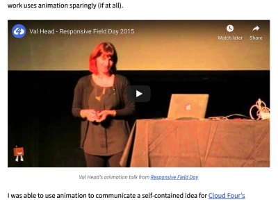
[/c4flexembed]You can use c4flexembed inside c4figure to add a caption to your embedded content.
[c4figure caption="Val Head's animation talk from <a href='https://www.responsivefieldday.com/'>Responsive Field Day</a>"]
[c4flexembed]
<iframe width="560" height="315" src="https://www.youtube.com/embed/O1SQ7FOVO_U" frameborder="0" allowfullscreen></iframe>
[/c4flexembed]
[/c4figure]A featured image is pulled outside the content column, but isn't quite full-bleed. We accomplish this using u-pullSidesX utility classes.
<div class="u-pullSides1 u-md-pullSides6">
[c4figure]
<img src="https://cloudfour.com/wp-content/uploads/2020/01/wallywood22panel1600.jpg" alt="Wally Wood’s 22 Panels That Always Work" width="1600" height="1215" class="wp-image-5679" />
[/c4figure]
</div>
Here, the combination of u-pullSides1 u-md-pullSides6 will pull the image just outside the content container on small screens, and quite a bit more on medium and larger screens.
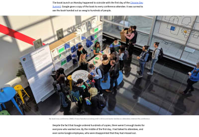
If you have an image you really want to showcase, try using the u-release class to make it full-bleed. Be aware this works best with images that are much wider than they are tall, otherwise users with very wide browsers may find the image fills the entire screen.
<div class="u-release">
[c4figure caption="My book was conference SWAG! It was handed out along with t-shirts and water bottles as attendees entered the conference."]
<img src="https://cloudfour.com/wp-content/uploads/2018/11/book-swag-at-cds.jpg">
[/c4figure]
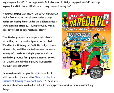
</div>Use a combination of sizing utility classes and layout utility classes to scale and image and float it left or right.
<div class="u-sm-size1of2 u-sm-floatRight u-sm-spaceLeft1 u-md-pullRight6">
[c4figure]
<img src="https://cloudfour.com/wp-content/uploads/2020/01/dd5-cropped.jpg" alt="The cover for Daredevil issue 5, with a caption promoting art by Wally Wood." width="1957" height="2795" class="wp-image-5682" />
[/c4figure]
</div>
Here, u-sm-size1of2 will keep the image sized to 50% of the content column, u-sm-floatRight will float the image to the right on small screens and larger (but not very small screens). u-sm-spaceLeft1 ensures there's margin on the image so text doesn't run up against it, and u-md-pullRight6 will pull the floated image slightly outside the content container on medium and larger screens.

