The below is the code for invoking a Piechart.
var pieChart = new PieChart(container_element, data, options)container_elementis the DOM element into which the Chart is to be appended.datais the data required to draw the chart.optionsare the optional features that can be used to alter the chart.
container_element is the element in which the graph is to be drawn. The
container_element can be one of the following things,
- Class Name of the element in the format
.class-name. Eg:<div class="chart-container" id="first-container"> </div>
var element = '.chart-container';
- ID of the element in the format
#element-id. Eg:<div class="chart-container" id="first-container"> </div>
var element = '#first-container';
- The whole DOM element itself.
Eg:
<div class="chart-container" id="first-container"> </div>
var element = document.querySelector('.chart-container'); // or
var element = document.querySelector('#first-container'); // or
var element = document.getElementsByClassName('chart-container')[0]; // or
var element = document.getElementById('first-container');
The data format used for PieChart is simply an array of arrays. Each inner arrays
contains the X and Y value of each co-ordinate.
Data Format:
[ [x1, y1], [x2, y2], ... , [xn, yn] ]
Example:
    var data = [
                  ['Jan', 10],
                  ['Feb', 70],
                  ['Mar', 30],
                  ['Apr', 10],
                  ['May', 60]
];All the optional functionalities that is needed to be added to the graph are added
in options part. This can be used for adding more functionalities or to customize
the current graph. options is a javascript object. The following can be added in
options part.
Defines the attributes related to the Pie of a pie chart.
Attributes
- color - The color of the each pie in the chart.
- Expected Value: An array of valid HEX or RGB code or even name of the color.
- radius - Defines the radius of the circle in Pie Chart.
- Expected Value: A positive real number.
- cornerRadius - Defines the radius of the the corners so as to make it curved.
- Expected Value: A positive real number.
- curve - Defines the total angle in degree in which pie chart to be drawn.
- Expected Value: A real number between 0 and 360 (both inclusive).
- startAngle - Defines the angle in degree at which pie chart should start to draw.
- Expected Value: A real number between 0 and 360 (both inclusive).
- padding - To define the width between two adjacent arcs in Pie chart.
- Expected Value: A real number.
- chart - To define the properties of horizontal grid lines.
- type - Specify the type of chart.
- Expected Value:
doughnut.
- Expected Value:
- width - The width of the doughnut chart.
- Expected Value: A positive integer less than radius.
- type - Specify the type of chart.
Example:
var options = {
    pie : {
        chart : {
            type : 'doughnut',
            width : 50,
        },
        color : ['#CDDC39', '#4CAF50', '#009688', '#00BCD4', '#2196F3', '#3F51B5', '#673AB7'],
        radius : 250,
        cornerRadius : 3,
        padding : 1,
        curve :360,
        startAngle : 0
    }
};Defines the transition or animation of the arcs involved in the graph.
Attributes
- animate - To specify whether animation is needed or not.
- Expected Value: Boolean.
trueorfalse.
- Expected Value: Boolean.
- duration - To specify the duration of animation.
- Expected Value: A positive integer which is duration in milliseconds.
Example:
var options = {
    transition: {
        animate: true,
        duration : 2000,
    }
};Defines the margin that should be added to the canvas by the user.
Attributes
- left - The amount of margin on left side.
- Expected Value: A non negative integer.
- right - The amount of margin on right side.
- Expected Value: A non negative integer.
- top - The amount of margin at the top.
- Expected Value: A non negative integer.
- bottom - The amount of margin at the bottom.
- Expected Value: A non negative integer.
Example:
var options = {
    margin : {
        left : 20,
        right : 20,
        top : 0,
        bottom : 0
    }
};Defines about the tooltip that shows co-ordinates details. The co-ordinates
values are available in the scope and can be accessed by using this.xValue
and this.yValue for X and Y axis values.
Attributes
- show - To specify whether the tooltip needs to be displayed or not.
- Expected Value: Boolean.
trueorfalse.
- Expected Value: Boolean.
- class - User defined CSS class name for the tooltip.
- Expected Value: A user defined CSS class name.
- listener - Listeners to which the tooltip should appear/disappear.
- Expected Value: Valid listeners. If more than one, separated by space.
- body - Predefined template for body of tooltip.
- title - Title to be shown on tooltip body.
- Expected Value: A string value for title.
- xLabel - Label for X Axis values.
- Expected Value: A string value for x axis value label.
- yLabel - Label for Y Axis values.
- Expected Value: A string value for y axis value label.
- title - Title to be shown on tooltip body.
- formatter - User defined function that can be used to create the customized
tooltip. Within the function, user can get the current x-axis and y-axis
value as shown below
this.xValue- Contains the x axis value for the point.this.yValue- Contains the y axis value for the point.
Example:
var options = {
    tooltip: {
        show : true,
        listener : 'click touchstart',
        class : 'custom-tooltip',
        body : {
            title : 'SALES 2017',
            xLabel : 'Month',
            yLabel : 'Units sold'
        },
        formatter : function() {
            return this.yValue + ' units <br>in ' + this.xValue;
        }
    }
};Defines about the legend to be added so as to identify the arcs.
Attributes
- show - To specify whether to show the legend or not.
- Expected Value: Boolean.
trueorfalse.
- Expected Value: Boolean.
- position - The position where the legend needs to be placed.
- Expected Value: String. Either
toporbottom. Alsocenterfordoughnutcharts
- Expected Value: String. Either
Example:
var options = {
    legend: {
        show: true,
        class: 'legend-class',
        position : 'bottom',
        clickable : [true, true, true],
        height : 45
    }
};Here are the examples of the chart drawn, without using any options and with using the options that are available.
<div class="chart-container" id="first-container"> </div>var element = document.querySelector('.chart-container');
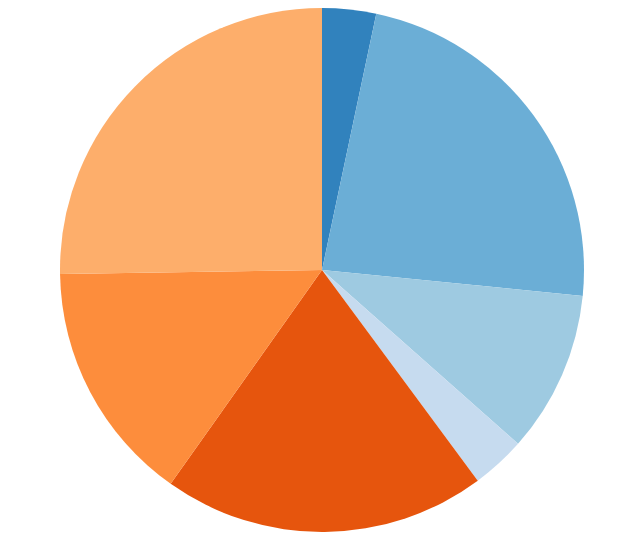
var data = [
['Jan', 10],
['Feb', 70],
['Mar', 30],
['Apr', 10],
['May', 60],
['Jun', 45],
['Jul', 76]
];Code Snippet:
var chart = new PieChart(element, data);Output:
Live example:
Editable working example here
Code Snippet:
var chart = new PieChart(element, data, {
  pie : {
    chart : {
      type : 'doughnut',
      width : 50,
    },
    color : ['#CDDC39', '#4CAF50', '#009688', '#00BCD4', '#2196F3', '#3F51B5', '#673AB7'],
    radius : 250,
    cornerRadius : 3,
    padding : 1,
    curve :360,
    startAngle : 0
  },
  margin: {
    left: 0,
    right: 0,
    top: 0,
    bottom: 0
  },
  transition: {
    animate: true,
    duration : 2000
  },
  tooltip: {
    show : true,
    listener : 'click touchstart',
    class : 'custom-tooltip',
    formatter : function() {
      return this.yValue + ' units <br>in ' + this.xValue;
    },
  },
  legend : {
    show : true,
    position : 'center',
  }
});
Output:

Live example:
Editable working example here